
Select Projects


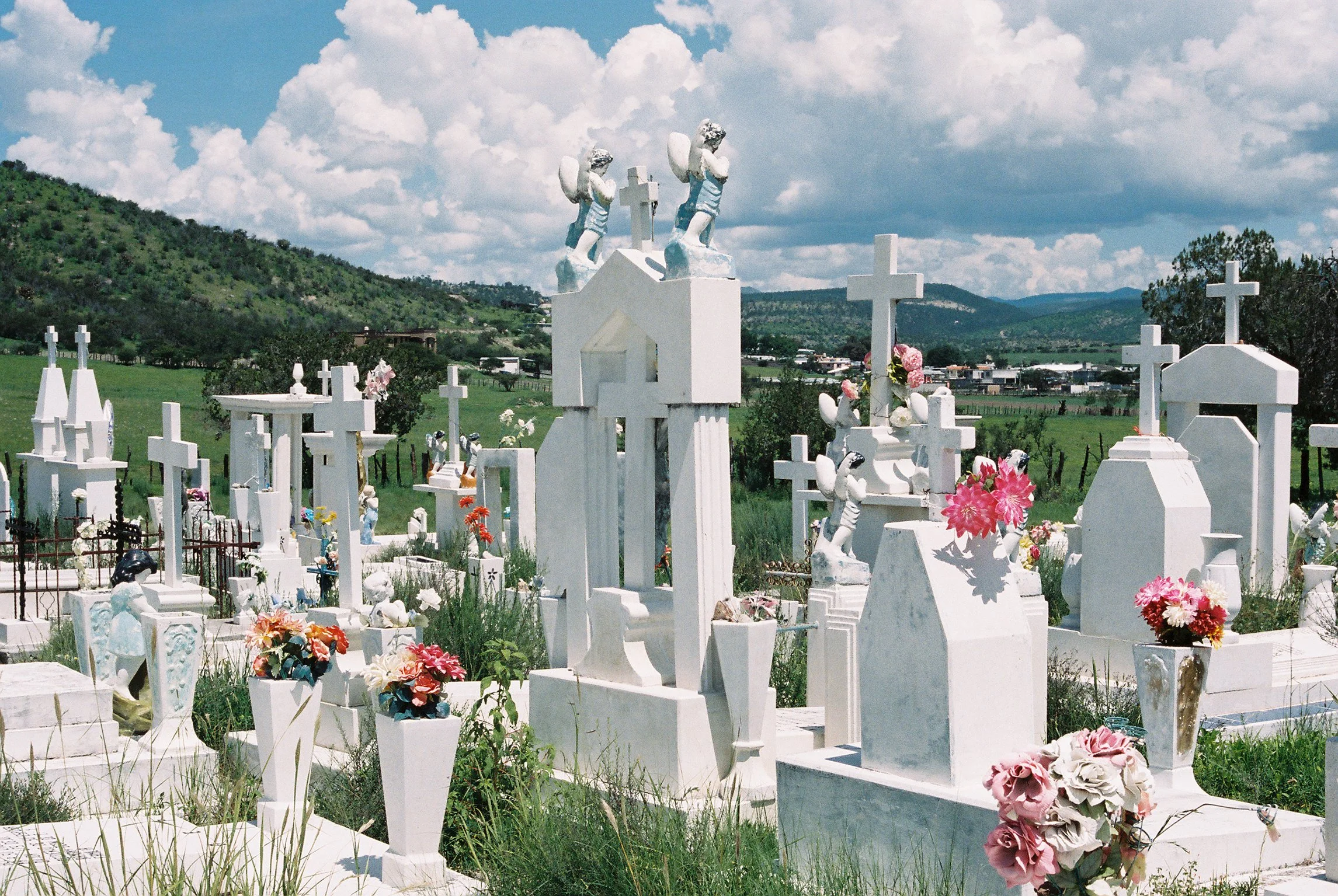


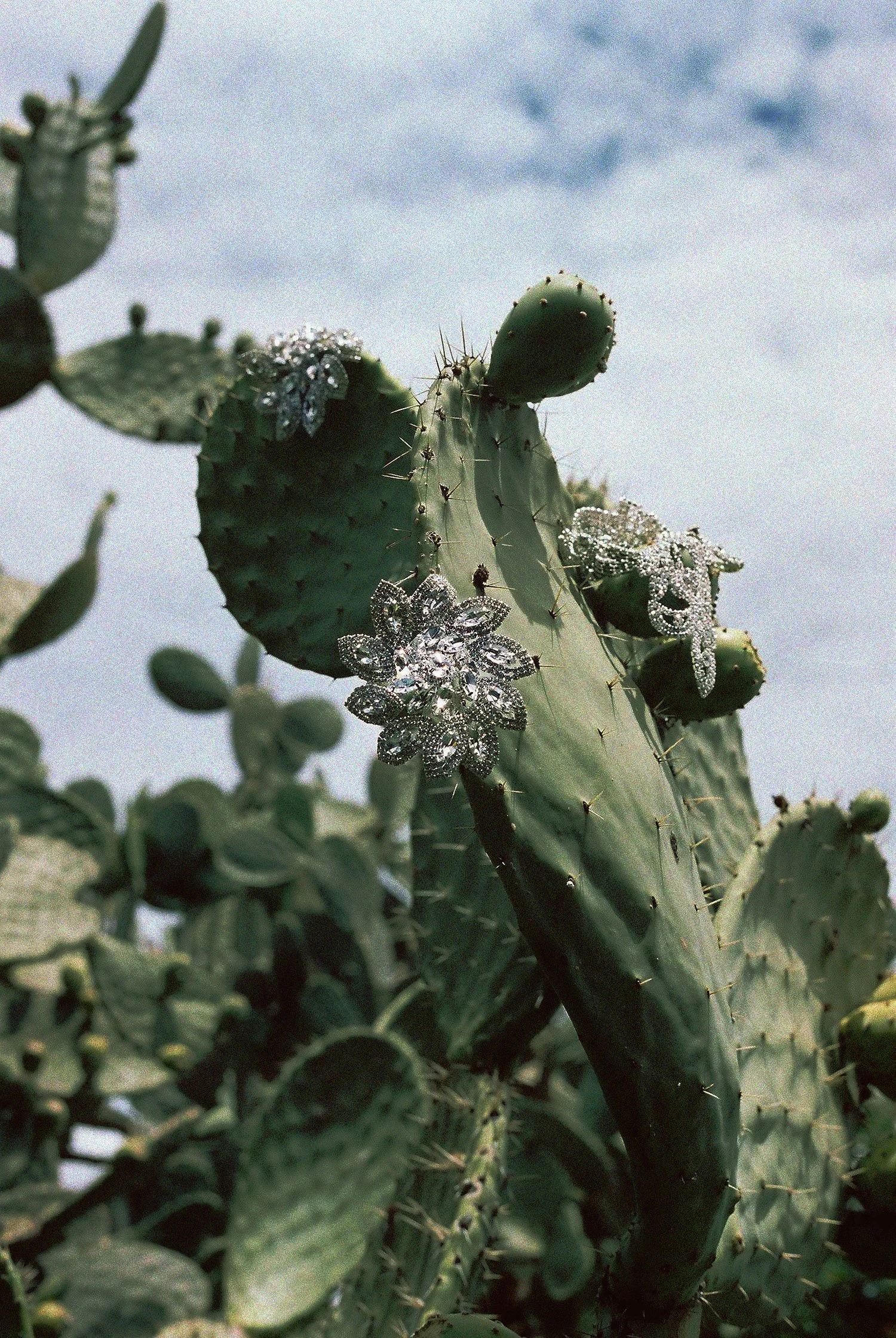


Select 35mm film photographs
Images taken using a Cannon Ae-1. Photo styling and art direction by me.


PT Zine Issue 01
A publication dedicated to experimental type design, PT Zine 01 marks the inaugural issue of the zine series. I was invited to contribute to its creation and feature my most recent typeface, Sufamelico, across five interior broadsheet spreads, and the front and back covers. Named after a Spanish cipher I grew up with, the typeface extends throughout the zine, which is filled with puzzles and imagery I designed specifically for this project. The interview itself is also set in Sufamelico.
The zine (edition of 50) and typeface will be available for purchase, all proceeds going to the Chicago Graphic Design Club.

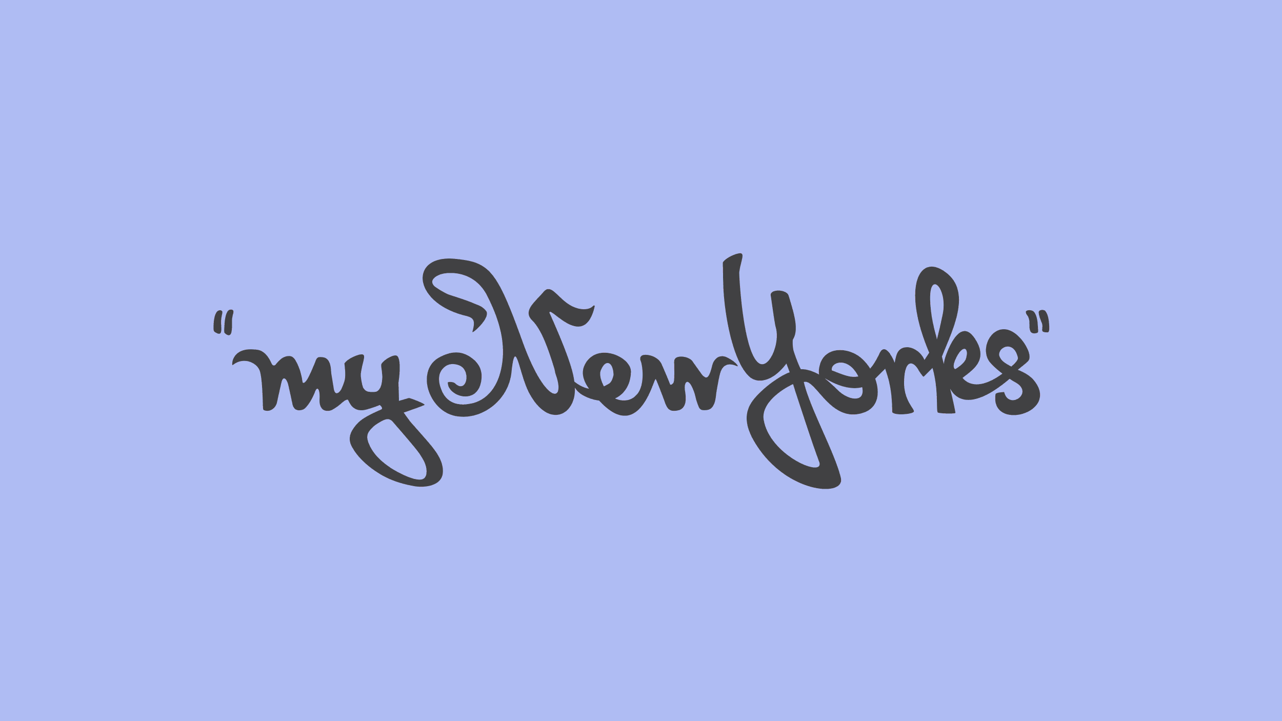


Custom type for the Art Institute of Chicago
This script was created exclusively for the Georgia O’Keeffe “My New Yorks” exhibition at The Art Institute of Chicago. It was hand drawn using cues from O’Keeffe’s own handwriting. The script was used in their print and digital ad campaigns to promote the exhibition.


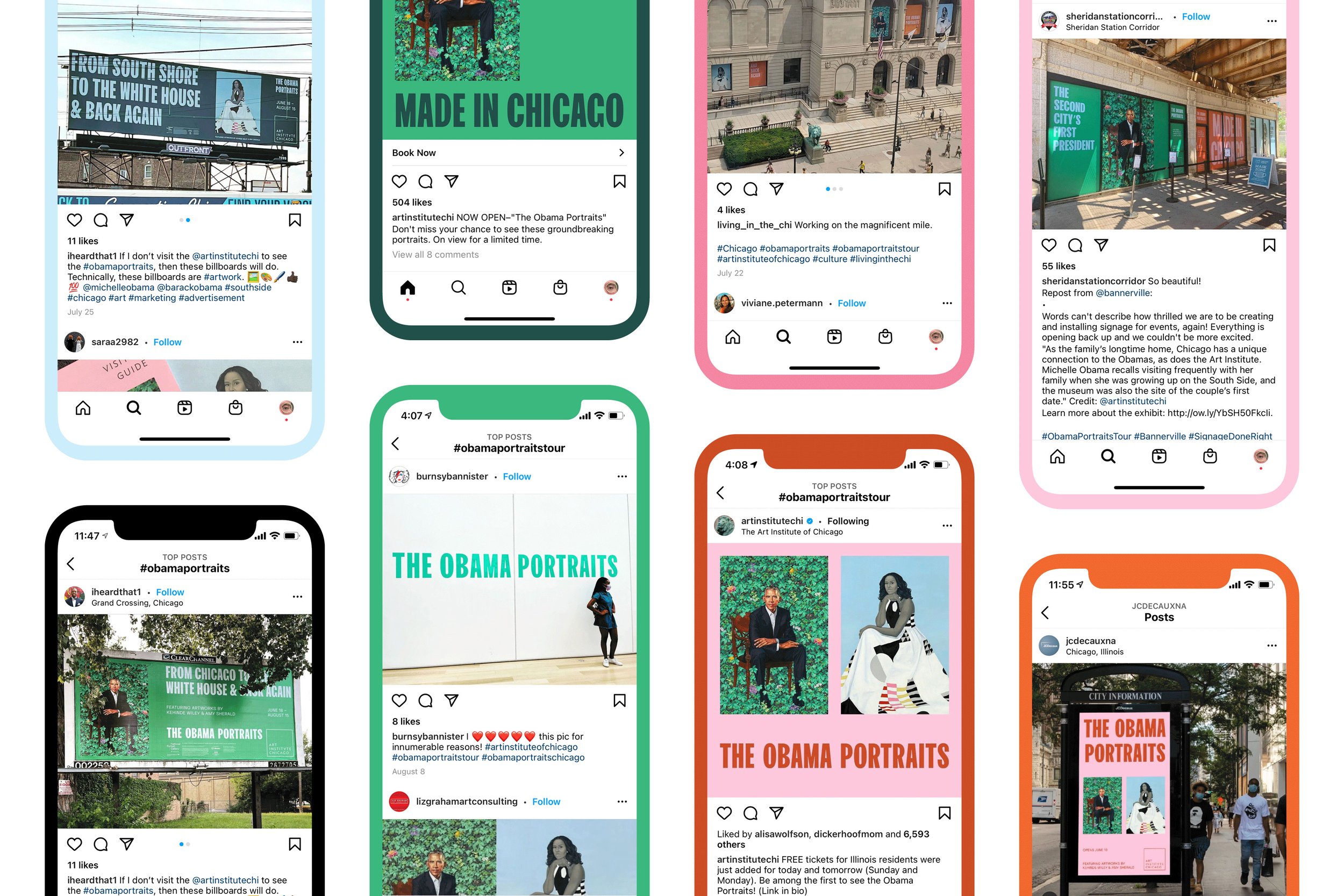


The Obama Portraits production design for the Art Institute of Chicago
“Made in Chicago” became the unofficial slogan of the campaign. In alignment with this message, the Art Institute of Chicago expanded its presence into ad spaces on the city’s west and south sides, featuring location-specific headlines. This effort marked the largest out-of-home campaign in the museum’s history and led to an increase in local attendance, surpassing pre-pandemic levels.
STA 2021 Award Winning Campaign

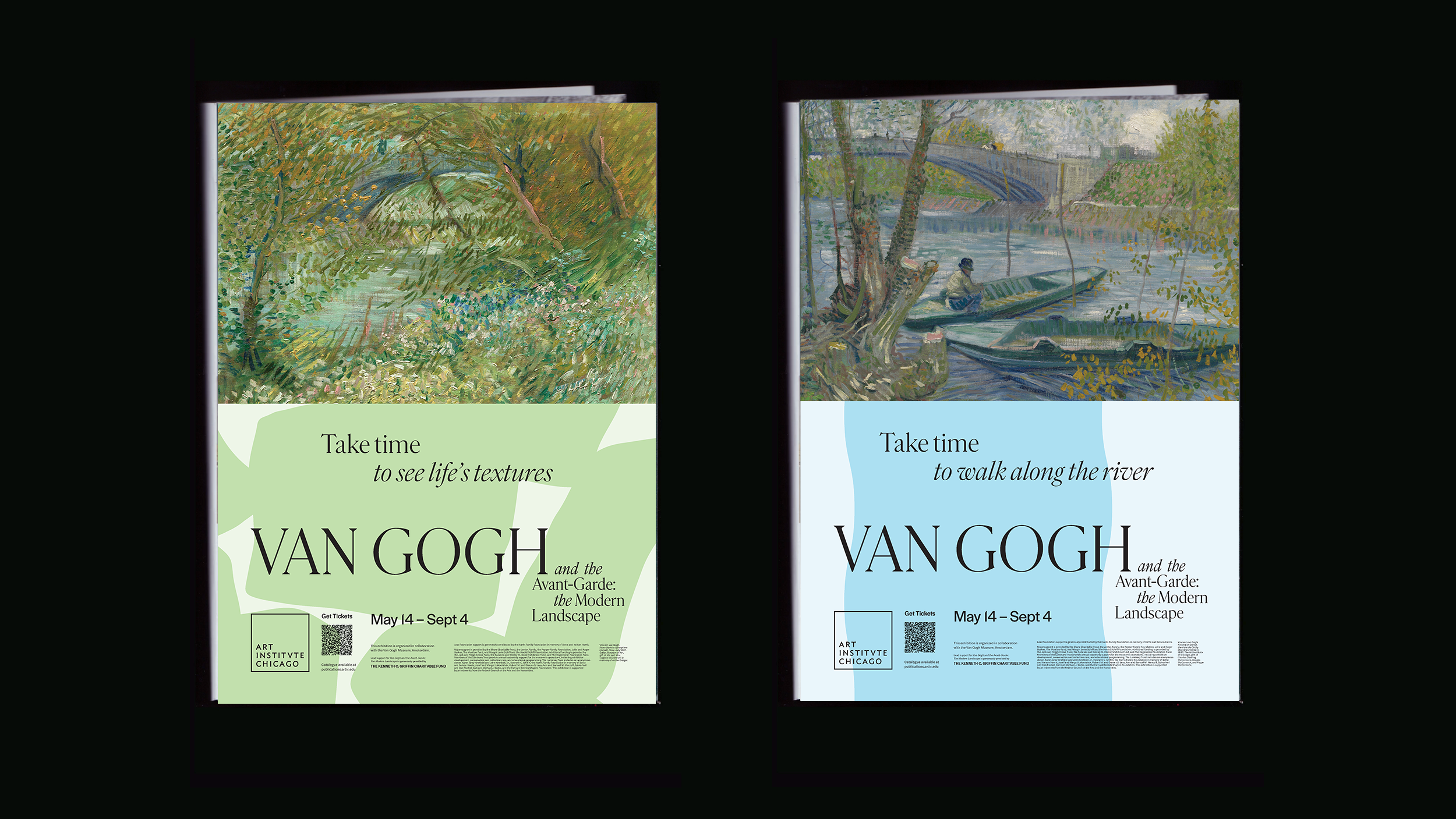


Van Gogh and the Avant-Garde exhibition ads production design
The Art Institute of Chicago featured ads across the city for the Van Gogh and the Avant-garde exhibition. Production materials included CTA bus wraps, city billboards, posters, one-page ads on the NYTW magazine, banners for the exterior of the museum and a car wrap in partnership with NASCAR.


Apsáalooke Woman and Warriors exhibition ads production design for the Field Museum


Logo and brand redesign for Bird & Tale
Bird & Tale was a logo redesign project for a boutique brand that specialized in curating and selling artist made goods. Operating both a small storefront and an online shop, the brand organized its inventory into six key categories: Mementos, Fashion, Gift Shop, Kids Goods, Floral, and Art & Design. The new logo is created in the image of a bird and the home in which it resides. A custom set of icons was also developed for each of the brand's categories.


Brâncusi Matrix bespoke typeface experiments
This sculptural typeface was inspired by Constantin Brâncusi’s sculptures and dot matrix printing. The typeface, at its core, is made up of circles and ovals. Equal-sized polygons can substitute the ellipses, to create an infinite number of alternate characters. The typeface is best showcased at large point sizes.
STA 2019 Award Winner


Ugly Gerry typeface production for RepresentUS
Ugly Gerry is a font created using the shapes of congressional districts in the U.S. The font by design, aims to demonstrate the absurdity of the gerrymandered boarders that influence the political system.
Project led by James Lee, senior art director and Ben Doessel, copywriter.
2020 ADC Annual Awards
2020 The One Show
2021 Webby Award
2021 Clio Award


Keychain coin holders illustrative design for ALDI
As part of ALDI’s brand initiatives, an ongoing series of designs was developed for their signature keychain coin holders. These playful, functional accessories support the brand’s well-known quarter cart return policy, blending utility with a touch of personality.
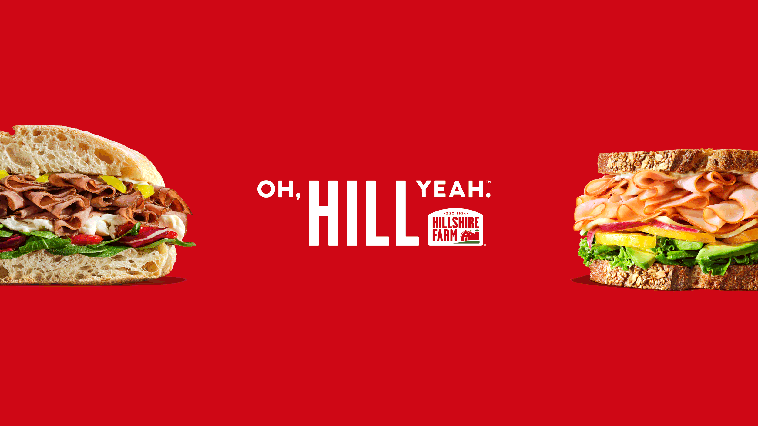


Oh Hill Yeah.™ social refresh and Sammies campaign for Hillshire Farm
Logo design


Made to Chill™ campaign assets for Coors Light
The Made to Chill™ tagline for Coors Light emphasizes relaxation and enjoyment, highlighting the beer's refreshing qualities. It conveys a sense of laid-back moments, perfect for unwinding and socializing, positioning Coors Light as the ideal beer for easygoing gatherings and leisure time.
The campaign included the development of endcards for the commercial spots, billboards, social assets, and digital ads, all designed to reinforce the Made to Chill™ message. A comprehensive style guide was created to establish best practices for language, typography, and visual elements, featuring a custom commissioned hand-drawn “Chill” script and an updated Rocky Mountain background.


Dream Journal poster experiments


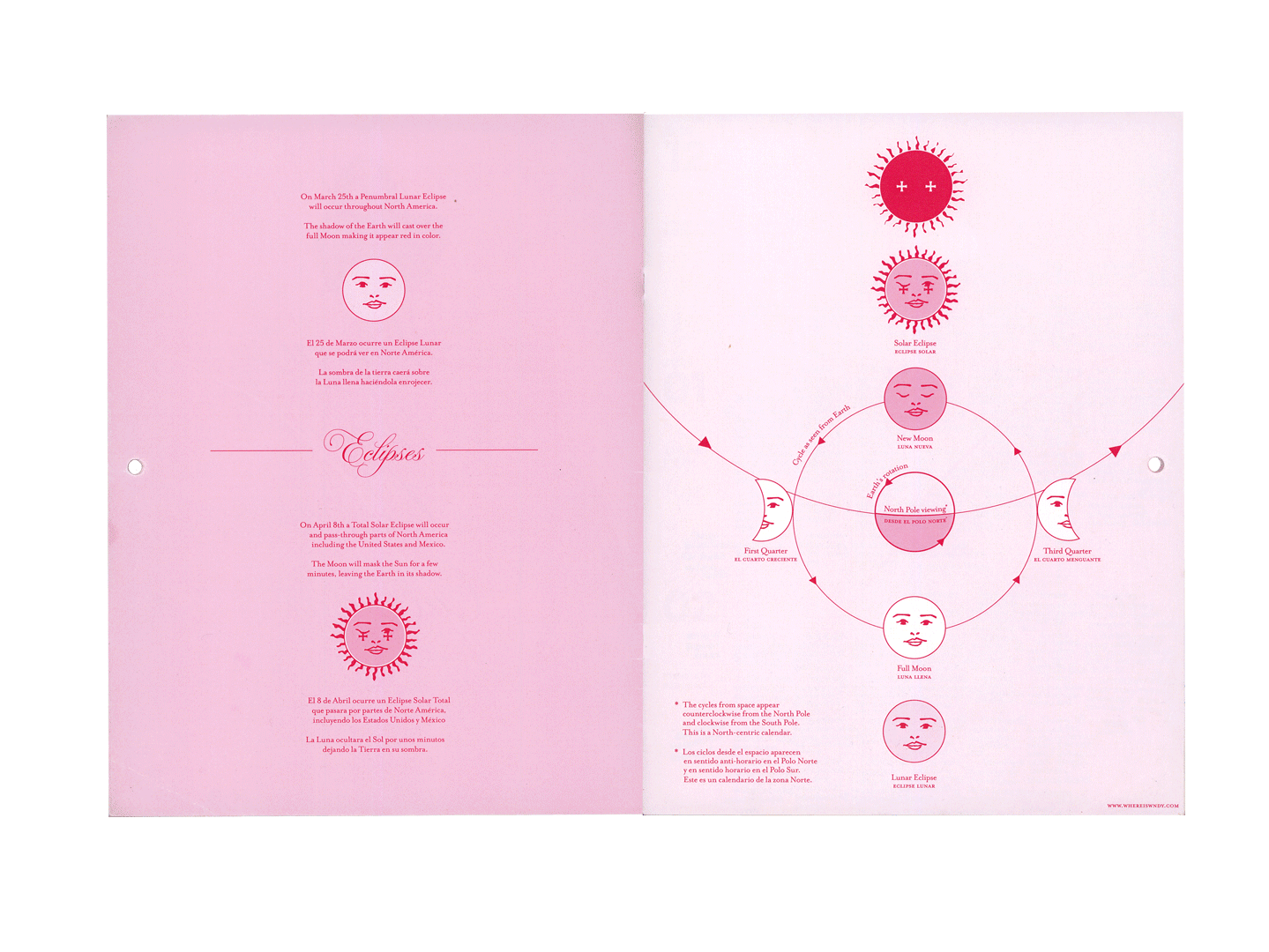


Wendy’s Annual Lunar Calendar
Every year I design and produce astronomically accurate lunar calendars that I distribute to friends, family, clients, and members of the arts and science communities.
2023 was a bilingual hand bound calendar with iridescent front and back covers. Each month featured a charcoal drawing and marked the phases of the moon. (8.5”x 11”) (25, 1 of 1 editions, each with a hand written message in the interior for each recipient)
2024 was a saddle stitch calendar printed on 80lb superfine Mohawk paper. The interior images were 35mm film photographs from my time at the Huntington Gardens in LA. This calendar also had a special graphic for the 2024 eclipse and a spread dedicated to the moon phases. (8.5”x 11”) (Edition of 50)
2025’s calendar was available for purchase. It was printed double sided on 120lb rough hemp Mohawk paper. It also paired with a resource guide for tips on using the moon cycles for haircare, gardening, and fishing. (11”x 20.75”) (Edition of 200 hand delivered on New Year’s Day to friends and family)
2026’s calendar will be available as a poster spread for the inaugural issue of PT Zine featuring my typeface: Sufamelico. The graphic for the calendar details the comet debris trails we cross in our orbit around the sun that result in predictable meteor showers throughout the year. I also included information on the winter hexagon asterism, the summer triangle, and the total and annular solar eclipses for 2026. (20”x 28”) (Edition of 50)
Selected Clients:
Quill, Bird & Tale, Chicago Public Schools, Courvoisier, Lettuce Entertain You Restaurants, and Midtown Athletic Clubs.
Previously, Wendy worked on projects for ALDI, the Art Institute of Chicago, Campbell’s, Coors Light, CVS, The Field Museum, Firestone, Hillshire Farm, Jim Beam, Kellogg’s, Kraft, Samsung, and Walgreens while at Leo Burnett.
Awards:
2025 DCASE IAP Grant
The Obama Portraits
2021 STA 100
Ugly Gerry Typeface
2021 Webby Award
2021 Clio Award
2020 ADC Annual Awards
2020 The One Show
Brâncusi Matrix Typeface
2019 STA 100
Villita Typeface
2018 STA100
2018 Typeforce 9